A Tiny Fish Refresh (and how to tell when to change up your brand)
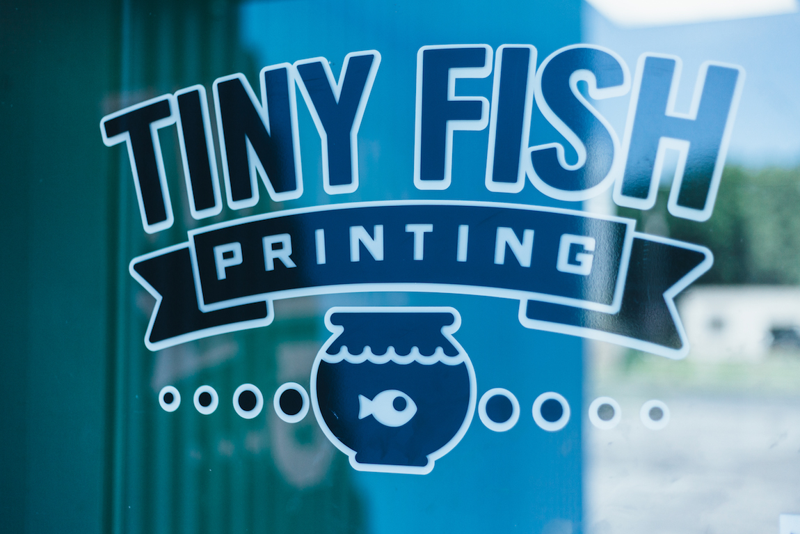
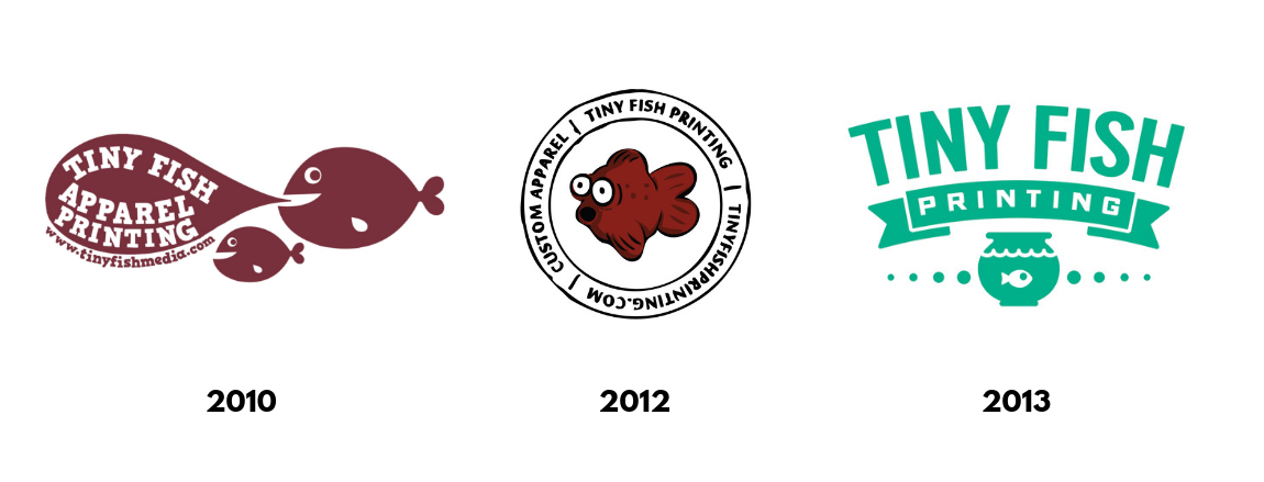
Our old logo served us well. But in the 6 years since we chose it, a lot has changed around the shop.
When we chose the design in 2013, we’d had just moved our 2 presses and 8 staff members into 139 Garson Ave which, at that point, was only 5000 sq/ft. Since then, we’ve grown to a staff of 30, added 4 new presses and our production space has expanded to 17,000sq/ft. Now, we’re adding finishing touches on an additional 3500sq/ft for our showroom and sales center.
Growth isn’t just measured in physical assets, though. In that time, we’ve honed our process and dialed in our specialties, added tons of services and continued to learn the practices that make us a better business and a more engaged community member.
So with all these big changes, it seemed like the time for a little update. With designer Trey Ingram, we revamped our old Tiny Fish logo:
Designing our new logo:
We wanted our new logo to reflect where we came from and where we're headed next. Here’s what we considered when we started the design:
• We wanted our branding to reflect our growth and our goals:
Our cleaned up, pared down design keeps the important aspects of our last logo while representing the ways we’ve polished and refined.
• We wanted our logo to last:
We wanted a design simple and classic enough that it could stick with us through all the changes we’ll see in the years to come.
• We wanted our branding to reflect what we do:
Our last logo fit our name perfectly, but didn’t connect to what we provide. The addition of the ink drop ties our logo to the screen printing process.
• We wanted our logo to connect with our customers:
Our customer community and our larger Rochester community are important to us. We wanted a relatable logo that could appeal to a wide range of people, from artists and apparel companies to the many diverse businesses we serve.
What hasn’t changed:
While we wanted to refresh our look, we didn’t feel like we needed a rebrand. Our name and our signature fish bowl design are elements that people easily recognize and associate with us, and they still represent us well. Our name came from the idea that we were a small fish in a big pond helping other small fish - and though we’re definitely less tiny these days, we’re still tied to that core idea.
How to tell if it's time to change up your brand
To rebrand or refresh?
Whether you’re a new company designing your first logo or you’re a well established business, branding is how you show your customers who you are and differentiate yourself in a sea of other options. And just as your company is always growing and your market constantly changes, your brand can’t stay a static thing. In the slogan-y world of marketing, the terms "refresh" and "rebrand" get tossed around a lot. Here's a look at what they actually mean:
Refresh:
A refresh is like a new coat of paint. You’re recognizable as the same company with the same message but now you’re looking a little spiffier. This might entail an updated logo, a different color palette, a new slogan, or a change in your company's tone and voice. Think of the brands like Starbucks or Nike who have altered their logos throughout the years to keep up with changing trends.
Rebrand:
When you rebrand, you aren’t just painting - you’re gutting the building and adding a whole new facade. You’re beginning life as a whole new company, with a new story and new appeals. This is a more involved process that will entail more research, resources and change on every single level. Think of when Dunkin’ dropped “Donuts” and centered itself more on lattes and iced coffees than pastries - with a whole new logo, ad strategy and brand identity to match.
When to refresh:
• When you’ve been inconsistent: If you’ve been using multiple logos, an extremely varied color palette or a bunch of different fonts, a brand refresh will help you focus your branding. Finding the best way to represent your business can take awhile to dial in, but consistency is an important step in gaining recognition and trust.
• When you no longer feel like your branding represents who you are: Like we mentioned above, it can take awhile for a business to understand their identity - and even once you do, it’s likely to change over time. Don’t be afraid to refresh your look to reflect new feelings or ideas.
• When you’re feeling outdated: Maybe the trends and tastes of your target market have shifted, you’ve grown beyond what you originally offered or your industry has begun to reflect a different style than when you first started. Design preferences naturally change and even the most “timeless” logo isn’t immune to shifting aesthetics. You shouldn’t follow every whim and trend, but if you’re starting to feel behind even a small refresh can bring you back up to date.
When to rebrand:
• When you’re going in a totally new direction: If you started in one type of industry but find yourself moving into an entirely new field, you may need a rebrand to effectively portray your business.
• When you’re trying to appeal to an entirely new market: Old Spice is a great example of this. Originally a product associated with an older demographic, their rebrand and subsequent marketing campaign, the memorable ads featuring Isaiah Amir Mustafa, allowed them to appeal to an entirely new group of consumers.
• When what you’re doing just isn’t working: If you’ve got lagging sales or a suffering public opinion, a rebrand can allow you to reinvent your business.

